Growth experiments (user acquisition & activation) 🌱
PROJECT OVERVIEW
As part of the Onboarding & Activation team, I worked on an array of growth experiments that drove those metrics.
EMPLOYER
Tally – an iOS, Android, and web app that helps users get out of credit card debt faster. Its main product offering is a low-interest line of credit (LOC). Users can add all of their high-interest credit cards, and Tally will pay off those cards with your Tally LOC. Then, the user only has to pay Tally back in one single monthly bill with its low interest.

Savings calculator
PROJECT BACKGROUND
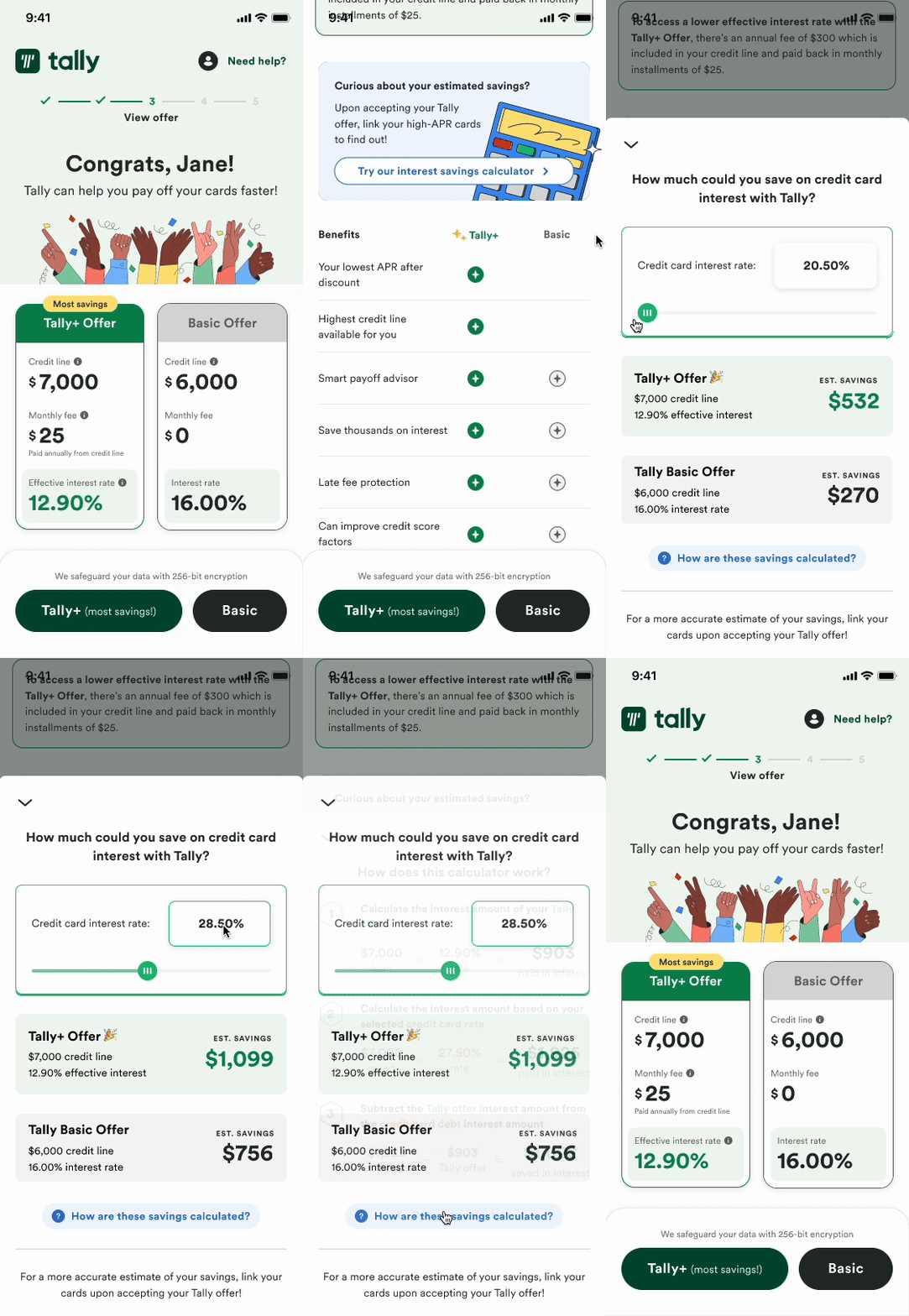
In the onboarding flow, a user must first enter personal information like their name, birthday, income, and address. A soft credit check is run to determine if the user is eligible for a Tally LOC. If they are, they are presented this offer screen to the right.
Once the user accepts an offer, they are then prompted to add all of their credit cards, provide their SSN, add a checking account, and finally validate their email. Only then can they access the app.
PROBLEM
Users drop off as soon as they start adding their credit cards upon accepting an offer.
HYPOTHESIS
By providing our users with an estimated savings amount as a hook, they will be motivated to add their cards and complete onboarding.
SOLUTION
Rather than simply providing a “hook” that said something like “add your cards to get your estimated savings!” I went down the path of educating our users. A few reasons for this:
Our users tend to have many questions on how things are calculated, not just what the answer is
By creating a calculator like the blue section, it allows us to explore this type of interaction at other points in the user’s journey
It’s been made clear by previous research that folks who can learn about financial literacy along the way trust our platform more, feel more confident, and overall have a higher success rate of paying off their cards faster.
———
A calendar for your bills
PROJECT BACKGROUND
As a debt management app, it’s crucial that our users know when upcoming bills are due. On the dashboard, users can take a peek at what’s upcoming.
PROBLEM
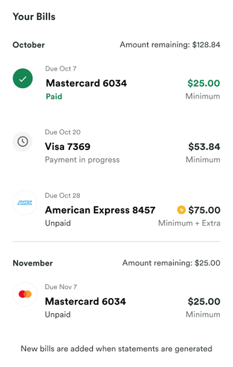
Currently, the Bills section in the dashboard is an exact copy-and-paste job from the existing Payoff tab. Users are not finding additional value from this section, and a few have mentioned that there’s an overload of information.
HYPOTHESIS
By revamping the Bills sections in the dashboard to be scannable, users will find this section useful and encourage them to pay their bills on time.
CONTROL
SOLUTION
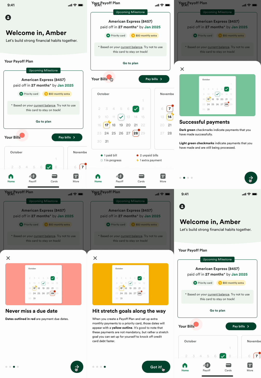
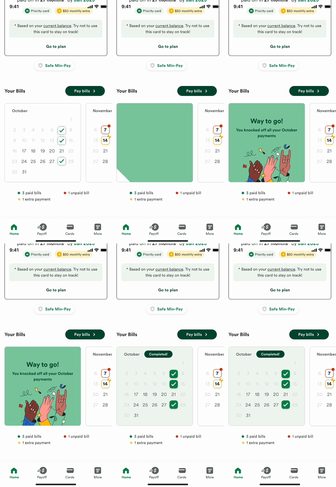
Having worked in the dashboard space at a prior company, I stood by my belief of the dashboard being a space for key information one can gather quickly. By introducing a calendar view that marked important dates, it did a couple of things:
By visually demonstrating upcoming payments, it creates a sense of urgency
I reduced the amount of visual clutter by removing all text from the main surface area
In addition, I brought in the pay bills CTA that would bring users to the Payoff page where they can select the cards they would like to pay off.
CALENDAR ONBOARDING
When a user first lands in their dashboard, the pink node will pulse, drawing the attention of our users. Tapping that node will trigger a walkthrough explaining the different components of the calendar.
TEST
MOMENTS OF CELEBRATION
It’s important to celebrate wins, big or small! When a user pays all of their bills in the month and return to their dashboard, they will be greeted with this fun animation.
TEST
———
Weekly check-in
PROJECT BACKGROUND
During our remote Design retreat, each designer took a stab at how we could make Tally more human–emotionally intelligent and cares about you.
IDEA
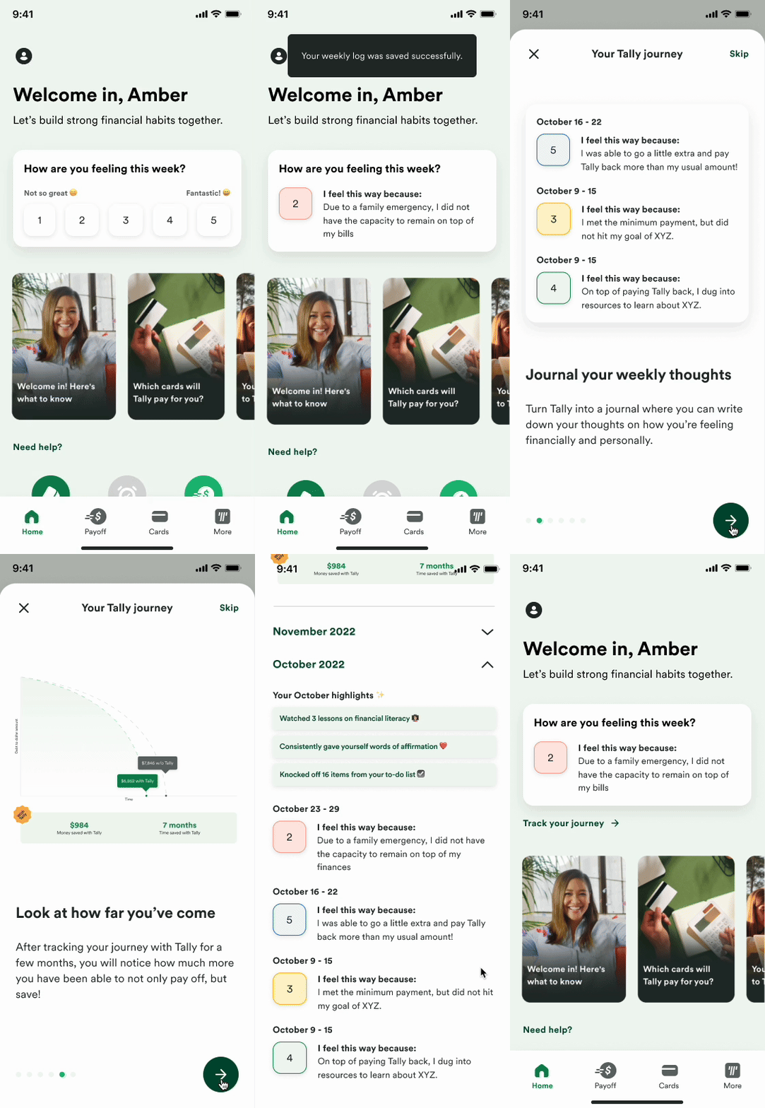
The journey to a debt-free life isn’t linear. The Tally website glazes over this as if it’ll be a breeze, when in reality, it’s a scary thing that takes a lot of work. With my piece, I wanted to create a journal of sorts that our users could come to and track their journey. It’s also a space that encourages education.
Here are a few key points to this project:
Breathe human emotions into the app
Collect the “why” of how someone is feeling as data that can be used to tailor one’s experience
You vs. you – by reflecting on your ups and downs, it shows that, despite the speed bumps along the way, you are still willing to keep going. Everyday you are learning to be financially stable.
Educate more with tools and resources rather than giving answers
Make it fun, celebrate often
