Part II: a personalized member dashboard 🍱
MISSED PART I OF PROJECT ONBOARDING? 👀 It covers the signup flow which comes before the dashboard experience. In case you’re interested, find it here.
PROJECT OVERVIEW
Despite being the entry point for every user, Onboarding always took a backseat to all other features on the Mento platform. A growing user base also meant a growing number of lost members who don’t know where to start or how to gain value from the platform. It was finally time to take a look at what’s (not) working and give the overall onboarding experience some love.
EMPLOYER
Mento – a career coaching platform aimed at unlocking human potential.
2-MONTH TURNAROUND // LAUNCHED (A/B TEST)

Context
PROBLEM
The member dashboard is confusing and lacks hierarchy, and coaches are spending significant time onboarding members rather than coaching.
HYPOTHESIS
By providing a snapshot of a member’s coaching journey, and offering useful to-dos and resources as they progress, members will know how to make the most out of the platform and improve overall engagement.
Before
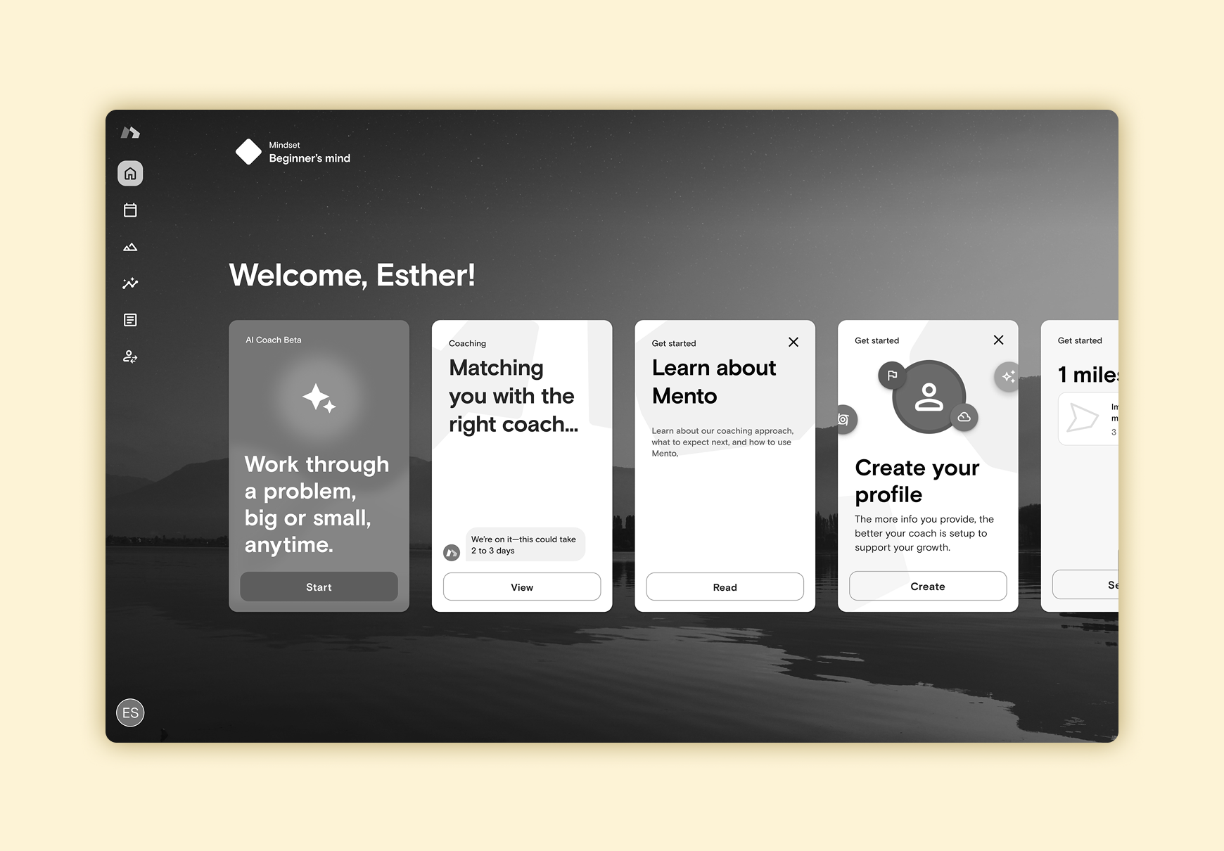
Upon completing the signup flow the member lands in their dashboard, comprised of a series of cards.
Time and time again members expressed feeling lost in the “sea of cards” and not understanding what they should be doing first/last.
The ordering of cards differs based on what was the most important, but the CTAs aren’t at all clear in terms of hierarchy.
Though not an end user’s problem, the internal team also struggled to maintain these cards due to lack of documentation and rules around the prominence of each card.
———
After
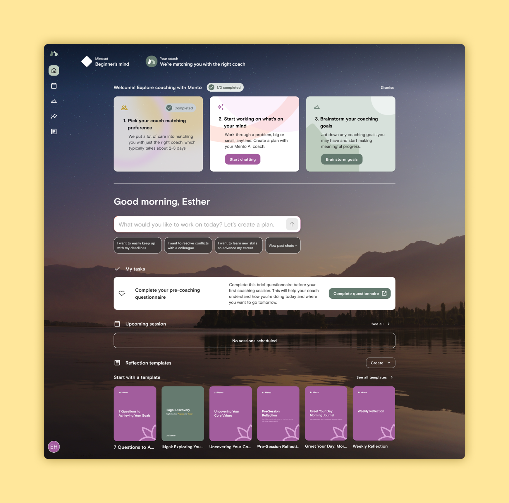
Turned the dashboard into a space where members can get a glance at their overall coaching journey.
Sections were ordered from high priority to lowest, with the top area being made up of things like notifications and to-do’s.
As the member progresses in their journey, sections appear or disappear, introducing our members to tasks and features in a timely fashion.
By turning the dashboard into a building block-like experience, it makes it easier to tailor the experience to each member and their needs, while also allowing our internal team to test and iterate faster.
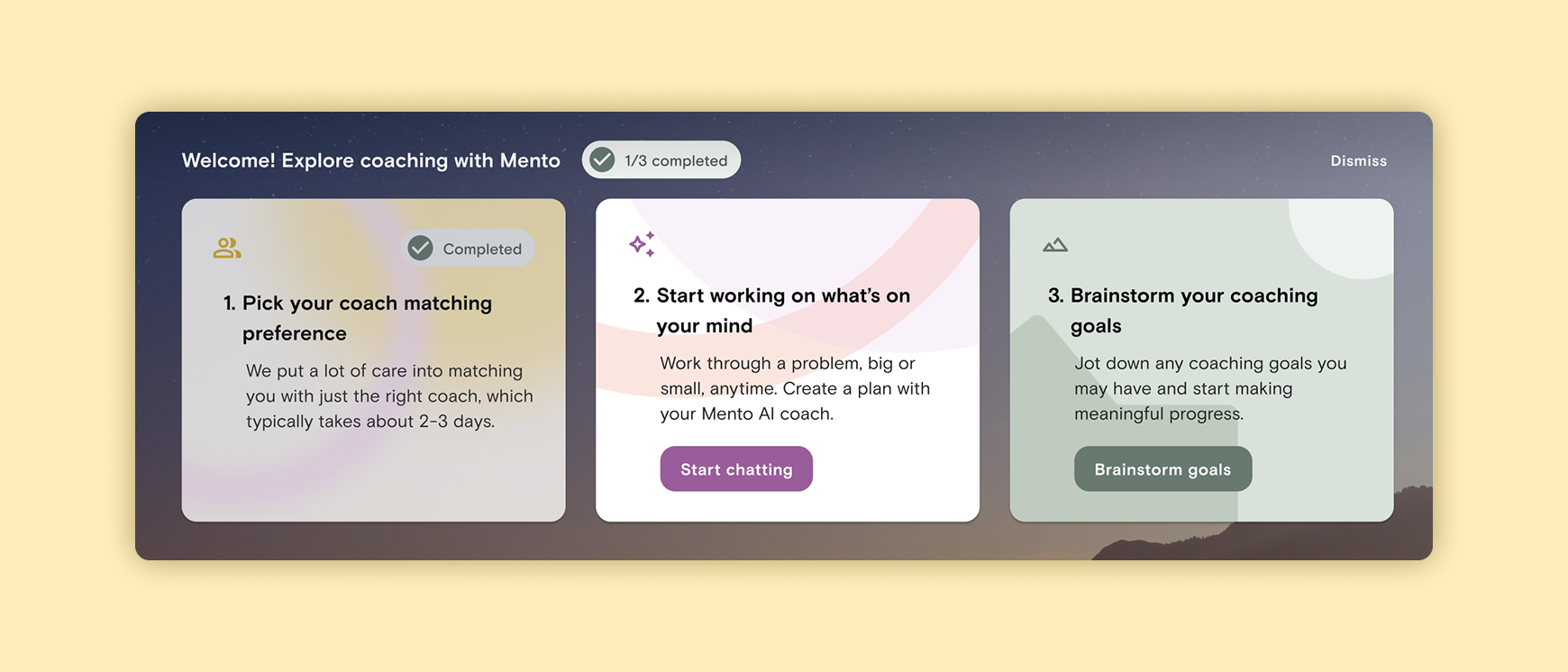
GET STARTED ON YOUR MENTO JOURNEY WITH 3 EASY STEPS
This is a dismissible section of introductory steps that encourages members to explore the high-value features. Once all three are completed, this section disappears.
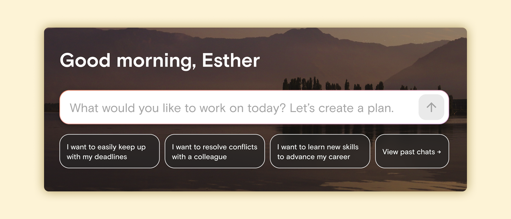
SAY HEY TO MENTO AI!
Our Mento AI coach is our latest feature, so why not place it front and centre and let it be your friendly concierge?
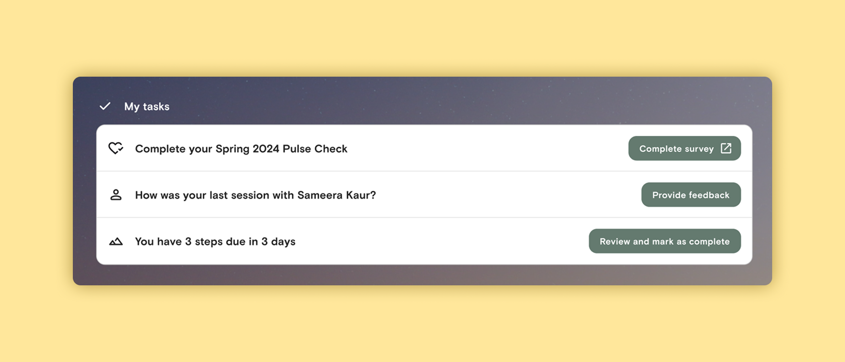
TIMELY TO-DO’S
Find tasks and notifications that require attention here, from upcoming Growth Plan steps to reminding you to book another coaching session.
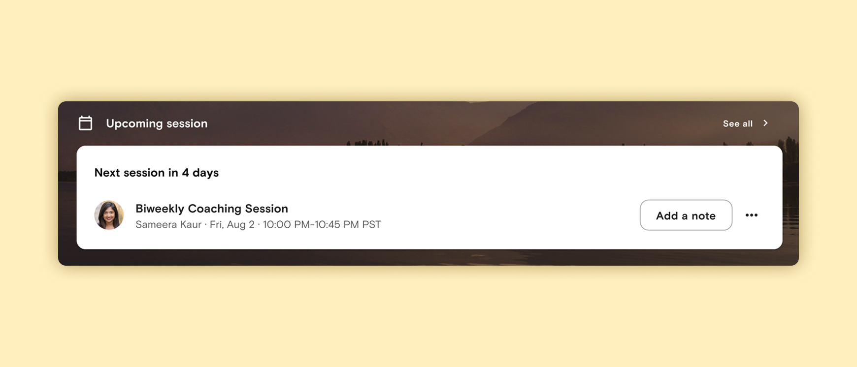
NEVER MISS A COACHING SESSION
Your next coaching session details will appear here. Add/view session notes, reschedule, or cancel a session.
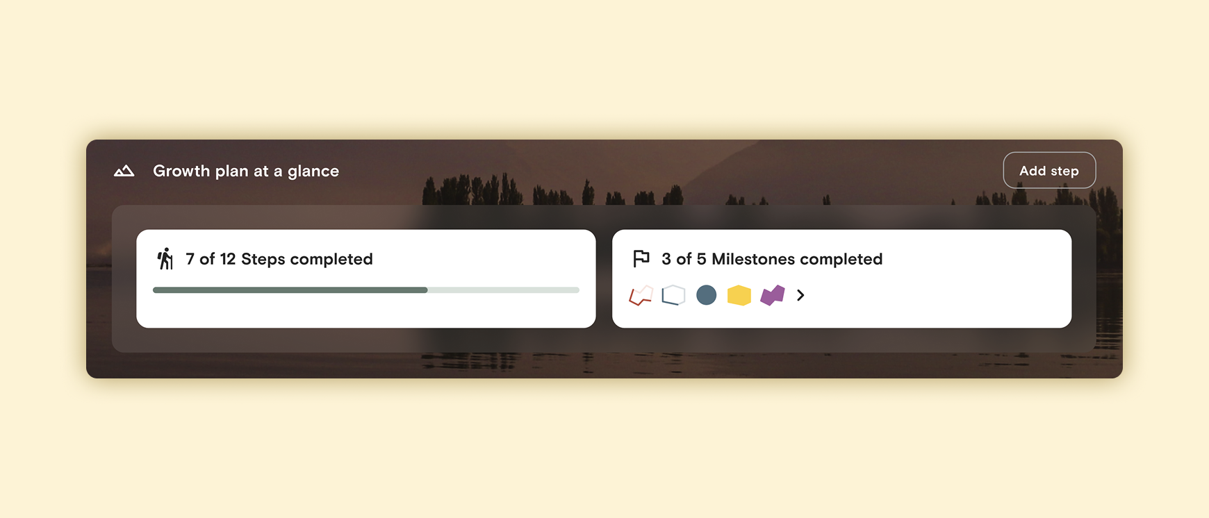
SEE HOW MUCH YOU’VE ACCOMPLISHED
Get a quick read on how many steps you have to take to reach those milestones! Also stop and look back every now and then ro reflect on your accomplishments.
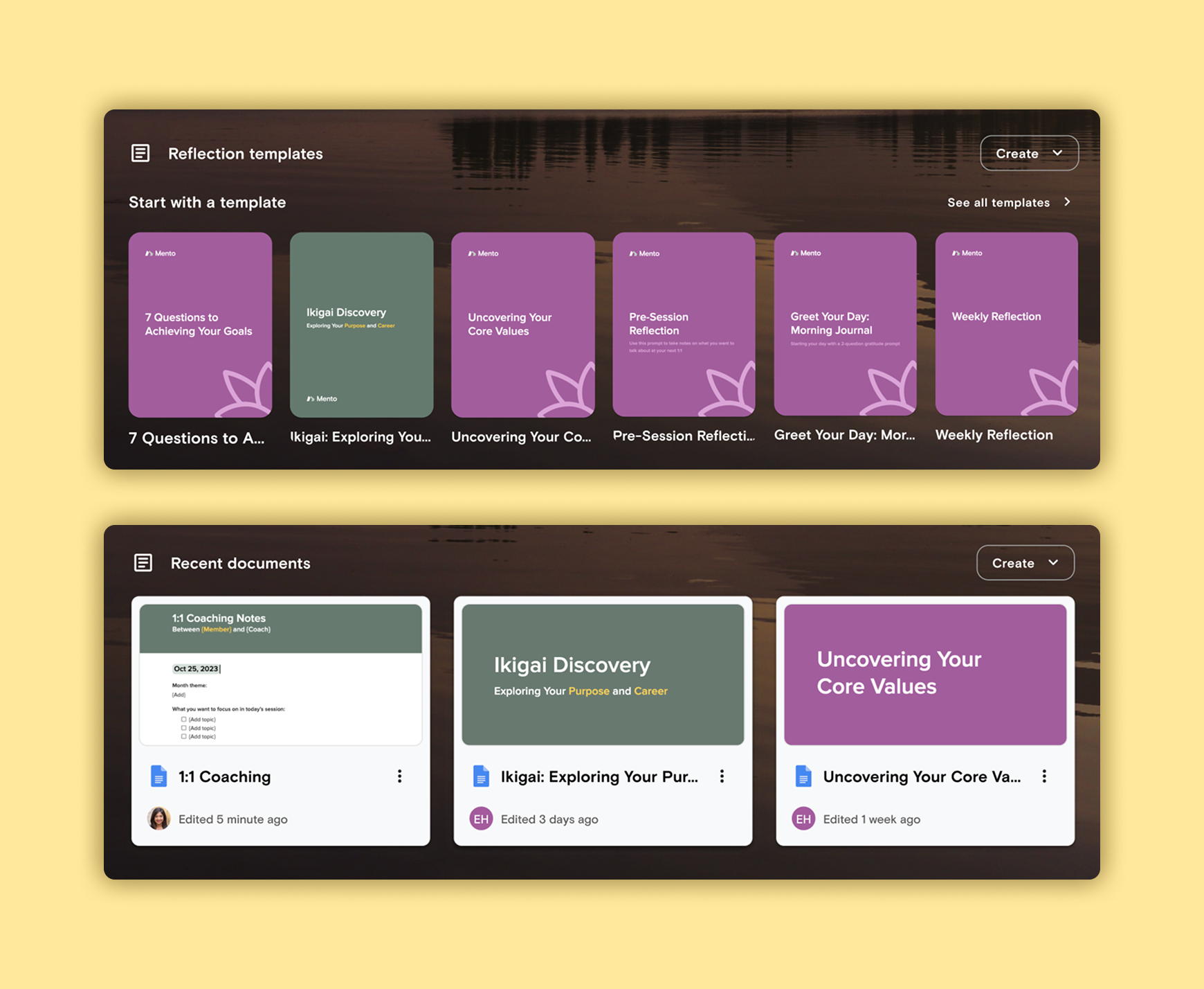
JUMP BACK INTO YOUR MOST RECENT DOCUMENTS
Whether it’s a 1:1 document shared with your coach or a self-guided reflection, easily access your most recent documents.
———
Impact & learnings
This was in testing just before I had moved on from Mento, so there aren’t hard numbers I could provide post-launch. That said, here are aggregated results from an unmoderated test done on usertesting.com AND on real members who had recently (last 3 months) gone through the previous onboarding flow:
80%
CLEAR ON WHAT ACTIONS TO TAKE TO PROGRESS IN THEIR JOURNEY
70%
OF EXISTING USERS EXPRESSED THEIR DESIRE FOR THE IMPROVED DASHBOARD
65%
ABLE TO EXPLAIN WHAT MENTO IS AND HOW IT COULD BE VALUABLE FOR THEM
Something that was tricky when working together with the engineering lead was load time of the dashboard components. If/when this dashboard gets rolled out to all users, we feel that for new members we can launch the dashboard section by section, allowing time for the engineering team to optimise the backend to support faster load times.
